Unlocking maximum productivity within creative teams is about a combination of clarity of vision, perfect communication and preparedness. Let’s delve deeper into each aspect to harness their transformative power.
Clarity of vision
It is very easy to fall prey on the fact that you feel you have a clear vision, and are communicating it to your team perfectly but trust me, the opposite is the case, or at least you should always assume that. If you actually manage to put yourself in the place of your direct reports, producers and clients, I bet each person has a different understanding of what you have in your mind — and probably you don’t have it as clear as you think you do.
At the core of productivity lies a crystal-clear vision. This means having an end in mind downloaded from your brain to “paper”. Make sure your references are on point and not confusing and for that Midjourney is an excellent tool. Sometimes looking for references and crafting beautiful moodboards can confuse your team.
Have a hero image that your team can follow and you will make sure that you are not improvising feedback or focusing on the small details that do not make an impact on the final work. Think of it as the compass guiding your team’s journey, it prevents distractions and ensures alignment among team members.
A good hero frame that defines — Mood, atmosphere, setting, design & composition, hero object and environment.
Perfect Communication
Communication isn’t just about talking; it’s about transmitting ideas precisely.
Flawless communication means setting explicit expectations and fostering an environment where ideas flow freely. Miscommunication can derail projects, wasting valuable time.
This means that you have to communicate and get into an arrangement with your team of what you want and the decisions that you make. Bad communication leads to misinterpretations that makes the work go into wrong directions costing time to steer back.
Ensure that every team member understands their role, the broader vision, and the decisions made. Regular check-ins and adaptable communication styles cater to individual team dynamics, fostering clarity and cohesion.
In a best case scenario, you train your team to be able to make their own decisions that fit your vision and your studio’s culture.
Preparedness
Preparation is the secret sauce. Take your time and don’t rush things. Having even 20 minutes to prepare to communicate your vision to your team can make a huge difference.
Anticipate questions and foresee roadblocks, arming yourself with solutions in advance.
Mental scenario planning ensures you’re ready for any curveballs thrown your way. This preparation allows for smoother interactions and immediate problem-solving.
These things are really powerful, they might sound like superficial prescriptions but nailing them all together do make a difference. In embracing the power of clarity, communication, and preparedness, you’re not just enhancing productivity within your creative team; you’re fostering an environment where speed and efficiency can really unlock incredible results, giving you extra time to focus on making the final product better, and iterate more.
In this post I will show you how you can increase your productivity 10x and get to better results faster in any creative discipline. We'll uncover the essence of perseverance and the iterative process in the realm of design and creative problem-solving.
We are all grownups here: We know the secret to success in the creative industry does not rely on the genius, or the talented, or even the...well genius. The secret is really that the ones that want to solve the design problem the most, and by want, I mean, REALLY want the thing, they will solve it. At any cost.
The Importance of Persistence in Design
When facing a creative problem, the designer that manages to create more value per output, is the one that will get closer to success. Design is a process of discovery, you will start doing something, and it will not match what you have in your head, so you need to iterate over and over until you start discovering that little seed, that little thread that you need to pull until you figure out what that thread is.
It is in the repetition, in the exploration and in the discovery that you will find what tool, technique or driving force actually starts to multiply the output. That is for example, the essence of style.
The Significance of Style
Style is a set of choices and decisions that are repeated over and over forming a pattern that is recognizable and over time, it starts to mature its coherence.
The Dual Approach to Problem-Solving
The formula is on one side understanding the problem and on the other side trying to brute force a solution, eventually you will manage to marry both. The more experienced a designer you are -more library, more tools, more skills- the faster you will transform overclocking your brain and trying to bash through a problem, but everything starts on those two energy demanding edges.
Application of Principles Across Creative Disciplines
Here is the thing, that principle can be applied from developing a custom set of brushes, to drawing circles in order to learn how to draw basic shapes and also if you want to learn anatomy in order to complement the foundations, and you manage to repeat this every day until it becomes second nature, then you will start finding solutions faster.
This happens also when you are trying to solve hyper complex design problems, in real time for example, working on a landscape or an environment, you need to understand your foliage brushes, distances, landscape design, scale, composition, etc. Then in order to get to a perfect frame, you need to go through hundreds of iterations.
In concept art, usually before starting drawing, people do thumbnails, and they do sheets of dozens of them until they find that seed of what they are looking for.
Same applies to character design, character designers go through many iterations until they find the right curves, the right colors, the right expressions, etc.
With photography its the same thing.
The Art of Discarding
Bear with me with this one... In philosophy, via negativa is used to explore the nature of existence and reality. It emphasizes the limitations of human language and understanding when it comes to describing complex or abstract concepts. By focusing on what something lacks or what it is not, philosophers aim to clarify the boundaries of what can be known or defined.
We judge design, by what its not, and so, we try to define what it is, since designing is bringing something useful into this world (serving a commercial purpose then digital design has intrinsic value), we poke, challenge and stress test design and see where it fails.
Some designers value their work too much. They believe that their output is something that comes from the gods, and treat their work. But its the other way around, you can create divine work only if your decisions translate to an end result that solves the design problem.
Therefore, like evolution, the strongest designs, meaning the ones that are judged by stakeholders, will eventually be challenged, morphed and adapted to fit that particular need that the design is trying to fulfill.
Therefore, you have to get used to discarding your work, to try millions of iterations until you learn something, until you find something that is useful not to satisfy your ego, but to solve the business problem and provide value.
The Path to Infinite Productivity
You cannot brute force your way without an intellectual understanding of a problem, but the secret, in the end is not too complicated. Start. That is 50% of the battle, then keep going, repeat, try something else, repeat again, gain confidence and speed, iterate as much as you can and have as many options as possible, have a backup plan and be a master of your craft. Be open to examine your work, as if you were an ice cold judge, poke holes and challenge it, be brutally honest with yourself and make sure that the only thing you are mostly aware of is your own ignorance. If you ruthlessly apply this principle to every single stage of the process, no matter how small, it will mathematically push you forward in your discipline.
I love the metaverse. I would read of metaverse design in those consulting forecasts, or blog articles about "10 future jobs unleashed by the web3 craze" and thought it was all BS. Sure Beeple opened a whole new market for 3D artists, but the web3 craze in the art world, meant that a lot of the creative class could now imagine completely new sources of income, new jobs being generated. I had friends working at decentraland, and there were other very promising projects out there that were trying to combine blockchain technology and NFTs to be able to create these unique metaverse experiences.
Let's also not forget that we were just fading out some heavy lockdowns and a crazy amount of these companies got a lot of traction, because a lot of the marketing or tradeshow budgets had to be allocated for something and people were craving experience on one side, but also a little window of opportunity was developing.
A lot of blogs started raving about how 3D designers, architects and coders would create a whole new market for these virtual experiences that people would use, even create their own economies. I was reading The Sovereign Individual by James Dale Davidson and William Rees-Mogg and Snow Crash by Neal Stephenson at the time and everything made sense: The future of work and money, the future of creative work and the new ways of experiencing the internet.
But the crypto markets started to collapse and the intoxication of all these new ideas started to fade off. But not at Journee –where I work– they were thriving.
Think Again
Metaverse Design is a completely new discipline. The new advances with Pixel Streaming technology and web interactions make it possible to showcase triple A gaming experiences directly in the browser, with e-commerce integrations, web layers and cms backends that make it extremely easy to create custom virtual experiences with very little technological knowledge.
This took me a lot of time to understand and it is a strong shift in the way that I've approached my work. We are not building video games, we are not building full scale CG projects. We are building unique custom experiences in a video game engine, we are also trying all the latest AI tools to include in our pipeline, even if they are clumsy, we get excited because we know 6 months from now they will be doing things we cannot even believe. Midjourney a great, obvious example that has evolved exponentially during 2023, and has become the best tool to enhance the art director's role within the company.
What is this new discipline?
The process of building metaverse experiences is fairly new. We are somehow in uncharted territories.
On the first hand, you have experiences like Decentraland, or Sandbox that are open world platforms where you can customize your avatar, purchase virtual land, etc. These experiences are locked to their unique visual styles and ecosystems. There is a certain degree of flexibility but the world is essentially locked as it it.
What we create at Journee are custom virtual experiences that are enterprise ready to be deployed for brand and artists around the world. I know it sounds like a boring sales pitch, but I can't contain my excitement to the work that we are doing, it is truly groundbreaking.
This discipline is a mixture of high-end 3D design, combined with video game design, combined with strategy, e-commerce, interaction design, cinematics and storytelling.
Metaverse Design
A shot from Mstyle Lab for Macy's created at Journee.
Let's call it the discipline of Metaverse Design. As always, it all starts first with an idea, a story that we want to tell, some client's objectives that need to justify the investment. As any part of the creative process the idea is the leitmotif for what should happen through the whole experience. A bit of dramaturgy, theatrics and attraction design needs to be complemented and married with the latest and most accurate visual aesthetics that one can find around.
Being able to construct everything possible, metaverse design usually demands that our worlds are always in a sense surreal, extraordinary.
Furthermore, If your worlds are not convincing, then, the whole illusion falls apart and people very easily close the window-tab, and all those months of effort die after 30 seconds.
The biggest challenge is to get your aesthetics right. This is what the users buy in probably the first microseconds of entering the worlds. Designing real time graphics means we can move really fast, but at the same time we need to design in 360 degrees. That means that our decisions and designs need to work from all possible angles, plus adding the fact that we need to transition from area to area and that needs thought too.
As a creative director, or as a designer not only you have to consider the visual look, you need to also think what set of logics and interactions your user will face.
Usually experiences are exploratory, micro-stories that help brands promote a new product launch. Other times the experiences can be educational, or even tailored for interactive commerce.
Therefore how the user interacts with the world requires a lot of thought processings.
User Experience Design
Let's add more complexity to the whole topic. We need to craft an experience that has to work on desktop, mobile, vertical and horizontal format. We need to make sure people from different ages are able to understand to navigate this new format. It's not like web design, where most people know what a hamburger menu is and thinks are pretty much thought through.
Being able to move around and interact with things require a lot of investment from the designer towards the user. It's a little pain tradeoff, to educate the audiences how to interact with the world, and it usually involves a first onboarding session done with a landing area and a micro-onboarding tutorial.
Consider also that these experiences can be crafted not only for young, gaming savvy audiences, but also, for middle aged executives. Usually the people that sign-off are top management and we can't afford that they don't fall in love within the first seconds of running around.
To ensure a user-friendly experience, we aim to minimize any potential difficulties. This means we steer clear of overly complex tasks or challenging puzzles that might overwhelm users. Instead, we focus on straightforward and easy-to-grasp micro gamified interactions, ensuring that the main points of each section are clear and easy to understand. Simple logics that help us make sure that the user leaves the interaction with the key takeaways from each area.
We also need to recognize that users employing web 2.0 style of media interactions typically spend more than the average time, between 3 to 7 minutes, exploring these type of metaverse experiences.
If they quickly lose interest, they are likely to disengage prematurely.
What is our goal? Ensuring that the user enjoys the experience while we simplify the intellectual effort required for each of these encounters, making the process easily navigable and incorporating an element of amusement, alongside stunning designs.
Typically, we commence with ambitious ideas, often complex in nature, but ultimately distill them into the most streamlined interactions for the experience.
Avatar design
Rey Loves Life - A virtual influencer project that I started and never took off.
Online expression has long revolved around presenting an idealized self, irrespective of the circumstances and as some sort of shield against the troubles of the outside world. The internet gave its anonymous users in weird IRC chat rooms, a place to explore social interactions, find love or even become someone they would never ever dared to become with a high degree of psychological safety.
In this realm, individuals can project their idealized selves, showcasing the embodiment of their aspirations.
Consequently, when fashioning avatars for our immersive metaverse experience, we regard avatar design as a pivotal touchpoint, treating it with utmost significance, and in some cases it becomes almost a parallel project on itself. There's artists that specialize only in avatar design, and I personally believe this will become a sub-discipline of this new frontier.
We always have to consider factors such as refraining from engaging in divisive discussions pertaining to gender, ethnicity, nationality, location, and age. What we strive to offer aligns with the demand for gender-neutral, enjoyable avatars, constantly seeking to defy conventions and introduce novel forms of self-expression within the metaverse, offering an extensive degree of customization.
Each aspect of the avatar undergoes thorough scrutiny, interpretation. Given the metaverse's unique nature, we often work with unexplored materials and unconventional combinations, leading to an extensive process of trial and error in designing features, material combinations, impossible fabrics or physics.
To help us facilitate this unique design process, we utilize a service known as "Really Player Me."–or RPM if you are in with the cool kids. This platform offers a system for grading and preserving one's digital identity online. Their concerted efforts to achieve cross-platform compatibility have been instrumental in establishing an interoperable metaverse experience, representing a significant milestone in the field.
Advantages and advantages of real time design
Our real-time design methodology allows us to work swiftly and efficiently, enabling the rapid development of complex and immersive environments. We can bring to life expansive landscapes, and cityscapes, all within remarkably short timeframes, all really exciting stuff!
As our clients and partners begin to comprehend the dynamic pace at which we navigate these projects, the creative iteration process takes center stage, undergoing countless transformations and refinements. This is not always great because you can get lost always trying to improve and improve things, and there is a time to freeze, and start putting everything together. This accelerated creative cycle fuels our passion for pushing the envelope of what's conceivable but it's a double edged sword.
One of the challenges we encounter is the harmonization of various elements into a finished product. We find ourselves occasionally prioritizing the pursuit of exquisite visual aesthetics without due consideration for the intricate web of interactions that sustains a truly engaging and user-friendly experience. This often leads us to grapple with the intricacies of balancing visual excellence with practical functionality, recognizing the fine line between artistic expression and usability constraints.
Optimizing and launching the project
Once we conclude the design and logic iterations, our focus shifts to optimizing these projects for online deployment. While pixel streaming technology offers great potential, the associated server costs pose a considerable challenge, particularly given the temporal nature of many of our projects.
Ensuring that our projects remain playable at sixty frames per second becomes imperative. Regardless of the visual allure, it's essential that our creations operate seamlessly on our servers, often demanding a trade-off between visual quality and performance.
This continual push for visual innovation occasionally overshadows considerations of practical functionality, prompting us to find a delicate balance between visual splendour and interactive efficiency. Our experiences with complex natural landscapes featuring abundant foliage or expansive urban environments highlight the cost of intricate detailing, necessitating careful optimization strategies.
Fortunately, the extensive expertise of video game designers and optimization artists comes to the forefront, guiding us through the process of balancing aesthetics with performance. While adhering to established best practices in 3D design and polycount management, we often find the creative process challenging these norms, resulting in striking visuals that warrant careful consideration and compromise.
The finished product as an immersive experience
As we near the completion of our experience, the culmination of our design, implementation, logic, user experience, optimization, and web integration processes, we finally hold in our hands the definitive metaverse build. This build not only encapsulates the experience but also serves as the end product.
This is an exhilarating phase, where the crafted experiences become unique platforms for users to engage with, offering insights into user preferences and behaviors while providing a delightful, interactive, and 360-degree brand immersion. The metaverse transforms the brand narrative, evolving it beyond mere advertising to an interactive storytelling experience with an unparalleled potential for user engagement and shared human–yes human experiences.
Forging new disciplines
Skytopia a huge metaverse experience designed for Shiseido.
Our journey into uncharted territories represents a pioneering effort, redefining the landscape of virtual experiences and forging new paradigms for future exploration. With the trust of forward-thinking brands willing to navigate the uncertainties of this new internet, we are not only shaping new best practices but also paving the way for a new discipline in itself.
This process spans a wide array of sub-disciplines, encapsulating design, branding, user interface, and virtual aesthetics.
These efforts extend beyond the creation of virtual worlds, encompassing the establishment of corporate identities within the metaverse.
It reflects the growing realization among brands of the necessity to embrace virtual experiences, recognizing the potential for fostering intimate, persistent brand ecosystems that enable interactive engagement, customizations, and transactions within a singular, brand-centric environment.
Anticipating the inevitable convergence between virtual and physical realms, we find ourselves contemplating the intricate details of foliage, the nuances of architectural design, and the harmonization of diverse brand presences within the metaverse. These endeavors not only shape the metaverse's visual aesthetics but also establish a new standard for interactive experiences, transcending the realm of novelty and emerging as a fully-fledged platform for meaningful, immersive interactions.
As technology advances and computational power becomes more accessible, the convergence of the physical and virtual worlds is no longer a distant vision but an impending reality. This paradigm shift positions the roles of metaverse designers, creative directors, and architects as integral components of a booming discipline, one that is uniquely positioned to bridge the gap between the virtual and physical realms, shaping the fabric of our future interactions and defining the landscape of our digital experiences.
Let's have a think about references and I will tell you why you scroll down pinterest when an idea itches your head and you can't truly nail it.
We usually have amazing ideas in our heads that we need to communicate to our peers, our clients.
We need to craft a vision about something that is in our heads, and because designers are designers because most of them can't really draw as good as they want to, we need different visual tools to express ideas.
Have you ever roamed the vast internet realm with a half-formed idea, feeling that it makes perfect sense in your mind, yet you lack the words or images to convey it effectively?
You want to create something new but all you see is recycled content. The images you see on the internet are processed versions of some old cohort of references that were trendy 6 months ago and a 3D designer just regurgitated 15 days ago on an NFT platform.
Even Midjourney, after some time of heavy use, starts to spit out similar shapes/textures over and over.
Now, what I really wanted to say with this blog post is - that usually - we scavenge the internet looking for that perfect reference that matches with that idea in our head for a very unique reason: we are looking for a reality check.
If the idea we have is great, it's already been done before, and it already exists in some shape or another.
It's a bit of a sanity check - having competition on something (in this case, an idea) means that you are not crazy, that it works.
That is why it's so easy to cross-polinate for insta originality... 80s vibe meets lo fi beats, superheroes but its a neo-noir, shark meets tornado.
Samurai meets Sci Fi
We scroll the internet, look at design and art books to make sure that our idea works, that there are pieces of it distributed in the zeitguised that we can put the pieces together into something that already resonates with the world. After all radically new things, usually need some time to get to the public imaginarium.
Then it relies on your creative capacity to put those things together and generate something original out of that. All art is recycled ideas from the past, we just live this eternal cultural collage that only moves forward.
The select few who bring forth novelty in this world are the true artists, serving as conduits for the art itself. What they receive is merely a whisper from the muses. The rest of us find ourselves tethered to the real world, attempting to make sense of it all.
This is a basic how to guide to become a creative director. Besides the obvious clickbait title I will break down how you can become a creative director in no time, even starting as a dumb designer at the bottom of the food chain. This text tries to be less of a prescription and more of sharing some mental models.
Develop you own ideas.
Find a style that you can scale.
Present, present present.
Own the responsibility.
Aim to be world class.
Develop you own ideas.
As the titles suggest being a director, means directing projects, people, teams. You set the vision and you bring everyone together where to go. You can't do that dry, empty, or copying everyone else. Your position only generates value if your vision is unique and clear. Solve problems, bring new ideas to the table that you can execute and always be developing and nurturing your vision and ideas. Collect them, share them, mix & match, go to the past and bring into the future.
People will take you in for your unique way of seeing the world. Do you have great taste, can communicate ideas clearly and also be business savvy enough to deliver value to your clients even from the early days? Then you are on your way.
Find a style that you can scale.
Similar as before, your style, is the personality that you bring into the table. You like clean and minimalistic things? Let that be your forte. You want to make the world a better place? Then focus on the projects that you feel are the most meaningful. Strive to be unique and find that which separates your from your peers. I remember one of my first assignments at the university, I had to design an energy drink. And everyone of a class of 300 people where coming with skinned versions of Red Bull cans. I got the highest score because I brought a bottle, at the time - a radical idea. But I wanted to differentiate myself of everything that was out there in the competition and it worked. That small lesson made me focus on always trying to be different, finding a style that I can scale.
I try to work so that my style becomes - timeless. I hate looking at Pinterest and seeing that everyone is doing the same type of work over and over. There are shape languages, color palettes, ideas that might change, but work that considers the fundamentals of design, composition, light and storytelling -and obviously- your unique (justified) spin is guaranteed to be successful in the short and long term.
I don't feel one ever masters this, but being aware is definitely a differentiating factor.
Present, present present.
For many, many years, I was always the guy making presentations at design studios. I used to design them, prepare them, and eventually go to present them. This is a very underrated task, many people fear the spotlight. Looking back some of the presentations I had in the past to clients are nothing compared to the ones I get to do on a daily basis directly to global clients, where I get to joke and convince people that the work that's been done is what was asked for and delivers value to them.
Offer always to create the presentation deck early one your career, use it to get your foot in the door the big table, be part of that meeting, see how the masters present, learn from them. And to our previous point, see what they are not doing and where there is room for improvement, but also, see how other people react to the jokes, the pacing, the editorial, the story beats. The more you present the more you will get to be yourself at the top. Obviously - try to do more public speaking and a bit of theater doesn't hurt.
Own the responsibility.
Directing projects and teams, means that you will be looked as the vision holder, and you will make decisions, and sometimes you will mess up. You will make someone on the team unhappy, you will not consider production needs, or you will make that bad joke that someone go offended. Own it. Be able and be ready to defend all your work, designs and ideas at each granular level. If you are insecure, be honest about it, maybe take more time to become more confident. If you fear things will be delayed or are heading into the wrong direction, open up, let people know. Some designers, artists, are happy just being on the other side, waiting for direction, masters of execution, the risk is easy to mitigate, but if you give bad directions, you are responsible of the output, and also for their wellbeing of your team. If you are just getting started, own each aspect of your work, and your decisions and soon you will be the one making decisions for teams and projects.
Aim to be world class.
Can't state this strong enough. Like it or not, in the era of the internet, you are competing with the whole planet, so, aim to be world class. A world class designer, with storytelling aspirations to grow, should look at whoever is on top of you that you admire and, in the beginning try to figure out what they do, that you can apply to become better. So simple. Compare your work with the whole world. Challenge yourself and be honest, own the responsibility of being self aware of your strengths and weaknesses so that you can double down on fixing both. Do you need to be more curious? Are your ideas the best in the world? Compare yourself with the best, and endure the pain of competing against the world and yourself. If you manage to tolerate that pain, understanding that it's just making you a better creative, then there is no way to fail.
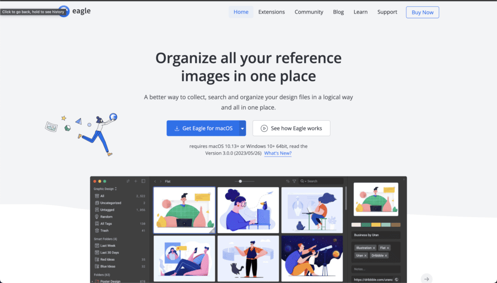
I found a really cool tool, something I've been looking for a long time. It's called Eagle.
It is a piece of software that helps you collect images and media from the internet (even 3D files!), store and sync them via Dropbox or Google Drive and organize and tag them. It is pretty easy and intuitive and it has a very sleek design with advanced features that do not disturb too much.
You can use it for both Mac & PC -I use it on both whenever I'm at my workstation or my MacBookPro.
The drawback at the moment is that it doesn't have 'cloud' sync or a tablet / mobile version. Hopefully that comes soon.
Another advantage is that its a one-time purchase ($30), so, no subscriptions. It comes with 2 seats, and if you want more, you can purchase them for half price, or just deactivate and activate licencences, which is a bit of a pain if you have more than 2 locations where you use it.
We have covered now the early stages of the creative process for an art director and now it is time to move into the early phase of preparing a concept or direction for your project.
This is a process that involves a couple of different phases. I will try to guide this in a perfect world scenario. But each project is different and most of what I share at this point is going to be flexible.
Conception refers to the stage of the process where you have to create a concept based on your visual ideas.
In a real world scenario you would establish with the client different stages for feedback, and different stages for changes. It may happen that different clients have different requests, or that suddenly the whole marketing team changed and you have new people with new ideas, or they just want to change things to establish their new authority.
There are many ways of guiding a client, and my personal recommendation is that you always keep him in the loop and involve him at the steps you need him to be involved to move your and his idea forwards.
It’s really important that before even start working you agree on how you are going to work, you should explain him your process and how you are planning to move forwards with each phase of the creative process.
You are being hired because you have a set of skills that they don’t and it is your job to guide them through your knowledge to what you think is best for them. This should also show in your project management skills.
So, after a couple of calls you end up with the following task.
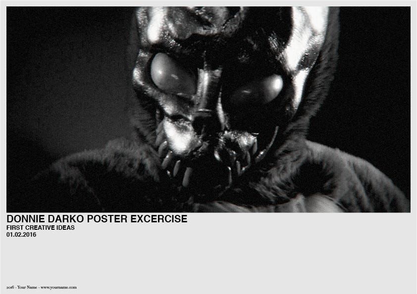
Create a poster about the film “Donnie Darko”.
Rough Directions
After your research is done you will have floating around your head a couple of ideas that you believe are stronger that others. Your guts will probably will be pulsating into going into a specific direction, and I will advice to trust your feelings Luke.
If you start with around 5–10 ideas I would recommend that you start trying to combine the stronger ones with the weaker ones. Or just try to see which ideas are similar, and start distill and concentrate all your creative power into 3 strong directions.
You should aim to have at least 3 possible directions to present.
Why 3?
One direction is very limited. There is no room for movement and give the client no chance to feel part of the creative process.
Two directions seems a little bit binary for my personal taste. You are basically telling the client, you can have either this or this. No-Go. It is not necessarily rude, but a little bit limited.
Three is for me a good number of choices. You can have a strong direction, an alternative and one completely different direction. You can mix it, or you can present 3 different options that can complement each other.
You can go for more options, this can be done if your client is more creative and you are in a rush trying to grasp what the client or project wants but if it is a formal presentation I would keep it simple. You do not want to overwhelm your prospects.
So lets say now that you have 3 different options for a specific topic. You have a folder with all your references, your research, etc.
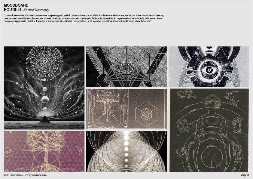
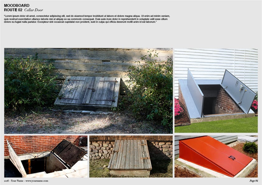
For our Donnie Darko poster we will present 3 quick possible directions.
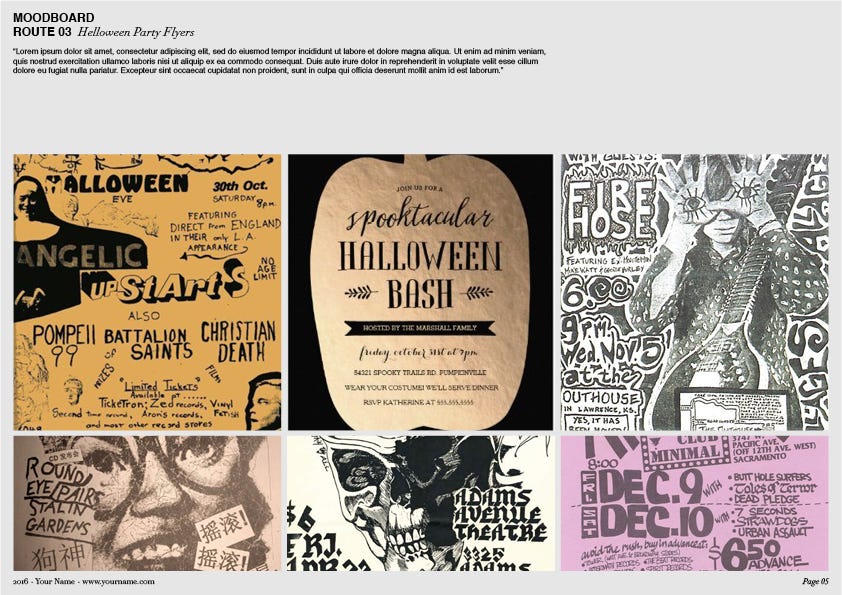
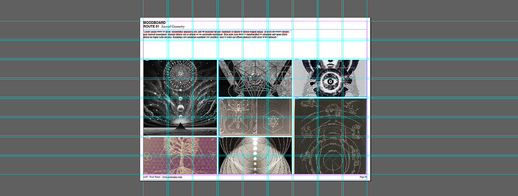
Route 01:Time Travel — (Sacred Geometry, Math, Occultism) Rout 02:Cellar Door Route 03:Helloween Party Flyer
Moodboards
Start creating moodboards.
A moodboard is a collection of reference images that try to illustrate a specific concept or idea by grouping different elements trying to convey a specific mood.
It is a map of your idea, using references of images that already exist, to try to guide the client to imagine what it is in your head.
So then when you share this with your client, you can discuss with him specific things. Such as “Do you like how this typoghraphy is working on this book?” “How do you feel about engraving it into a piece of wood?”
Dont place random images because they just look nice, try to find nice images that tell the story that you want to tell.
I sometimes try to tell stories in my moodboards, or organise them in such a way that they tell a story, maybe I will use landscapes or more abstract things in the left then towards the center introduce my characters and towards the right have some images that have a conclusion.
The idea here is that the client can read through and get your point.
This is a very subtle but key element when designing your moodboards. One very common misuse of this basic resource is just collecting images that look nice, pass them over and expect that the client or even other designers, get what you want.
You can really tell the quality of a designer or art director by the quality of their moodboards and how they express their ideas.
So now that you have your moodboard ready, it is the time to present your ideas to the client.
Note — For some inital parts of the process. Moodboards might just be a visual tool to get the client moving into one direction. After this is established more narrative moodboards, or moodboards that involve a bit more different images might come into place.
There is definitely no specific rules for creating moodboards, I think with great taste you will be able to express your first concepts, but be careful and keep it simple and tasteful, do not include things that you don’t want or are not sure because it is usually a rule of thumb that the client will pick up that one.
Presentations
A good presentation is a maker or destroyer of creatives and projects. The presentation is the medium where you will present your ideas. It becomes the guiding document for briefing your client, team, colleagues.
As a designer it is good to have some general idea of editorial design. Once again whatever we are doing here is presenting and selling our work and our ideas. A good presentation has to be clear and understandable. Everything has to be explained to the last detail.
It has to be ready made to be opened by someone that has no idea whatsoever about the project and by the time he finishes reading it it, he is sold with the idea.
It has to be clear and everything has to be explained, and if you design it well it will bring you a lot of success.
The following is an example of a good structure for a good presentation.
Cover — the cover page is the page where you present the project and the most general details about it such as date, client, and project name.
First Creative Thoughts — a brief introduction about the project. Here is where you state to the client your understanding of what you have to do and how you want to do it. The goal here is to introduce your vision of the project.
Challenges — sometimes I include a page that talks about the challenges that the project has to meet and the ones that the project is going to face. So for example we speak about the creative challenges that we want to accomplish, and the reality challenges that will influence our goals, such as limited budget, resource availability or time.
For the first presentation I would dive directly into the first different routes.
Do not fear over-explaining everything or being redundant. As mentioned before the presentation has to be self explanatory in every point.
Route / Direction 01–02–03 — So, I will assume I have a Title page that says “Route 01". Try to name every concept, this is actually part of the conception phase. It is up to you how creative you want to be with the naming. Some people are more playful or witty, some people prefer to be more direct.
The title has to resume your concept in one, two or three words. Try to make it catchy. The title has to resume your idea so when the client looks at the images he can already start constructing your vision in his head.
You should add a small description of your concept / idea and explain the benefits of this one.
After this, you can introduce the moodboard.
Conclusion (or finishing thoughs, summing up, etc.) — in this slide you will wrap up all your ideas. You can write down your top choice and why you recommend going into that direction, or just write some other things that are in your mind worth talking with the client.
Contact — Be mindful to include a thank you page with your contact information.
If your presentation is branded, much better. I mean, why would you not brand it? You are a professional right? This branding has to speak about yourself. You can have a logo, or your name, but the choice of color, typography and editorial design will also speak about your skills as a designer.
The best advice here is to have a template presentation with a template structure for the moodboard to speed and structure your whole process. This is key for every professional. Create assets that will save you time and energy.
Respect the grid
The grid will help you stay fit and organised. You will have to discover what grid works best for you and keep it in an editorial fashion.
This is the grid I used for one of the moodboard. If you compare the 3 you will notice that I modified the arrangement and the size of the masks of the moodboards but I kept using always the same structure. This will help keep your presentation entertaining and organised.
If you want to break the grid and be a bit more décontracté, do so at your own risk and only if you need to. I do not mean to preach a hard school on grid, but it helps to keep everything in order. If you want to take a creative licence with it, keep some other constants respecting the grid.
In other words, arrange the images as you want, but respect the rest.
Preparation
As a side note, it would be great when you can; before sending the presentation to the client to rehearse it a little bit.
In many cases you will just need to send over a PDF with your presentation and then keep the communication by email. But in many other ones you need to call the client and guide him through.
From my own personal experience, I prepare the presentation, read it 50 times, and believe that everything is perfect. But then when I am presenting it to the client I realise that there are many things that are not clear enough, or that I become very redundant or that the copy doesn't allow me to close up my thoughts. Or even find myself reading the copy out loud and realising that what I just read doesn’t fit the context of the conversation or I just said the same that I did 2 slides ago but with different words adding absolutely nothing to the pitch.
If you have some time, maybe some audience, try presenting it to someone else and fine tune the things that make no sense spoken out loud; listen to yourself and watch other people’s reactions.
Software
My two best options for presentations are Adobe InDesign, or Keynote.
Adobe InDesign is a great tool for creating editorial design. It is optimised for doing hardcore typographical work and it has a great grid system that will structure your output very easily.
It isn’t a very flexible program and it is a bit hard to edit images on the go, but I assure you, this is what you need. Use the grid. Be mindful of it and reap the rewards. You want structure and you want editorial. This tool provides you with that.
Apple’s Keynote, on the other hand is a more flexible tool. Very good for live presentations. You have some sweet animations and transitions and its very easy, fast and flexible to edit things on the go and spice up your work. But this flexibility can be a bit costly in terms of design.
If you do not keep track of it you might in time, start dragging errors and your presentation form will get lost.
I would not recommend Power Point. This is one of the most unsexy and terrible tools I have ever encountered and I am still shocked to understand how it is an industry standard.
So now we should have our beautifully designed presentation with our 3 routes and ideas. It is time to present it to the client.
Everything went great and he decided to go with the Route 01 — Time Travel, yeah!
It can happen that he also likes some ideas from the second direction. We take notes, and agree to a polished development of the idea for a second review in 1 week.
Now it is time to keep working. This has just begun…
Research is one of my favorite parts of the process. I actually enjoy most of them, but research feels like the golden moment. Anything is possible.
You get to spend time learning and experimenting and checking out all new kinds of cool stuff. Your mind is, or should be exploding with ideas and ways of connecting all sorts of new concepts and ideas, colors with typography, texture with different materials and so forth.
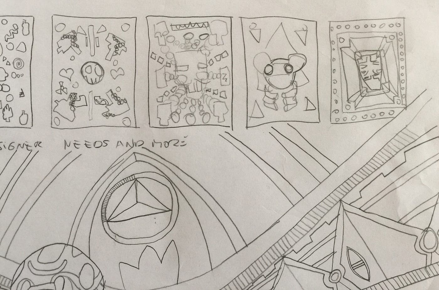
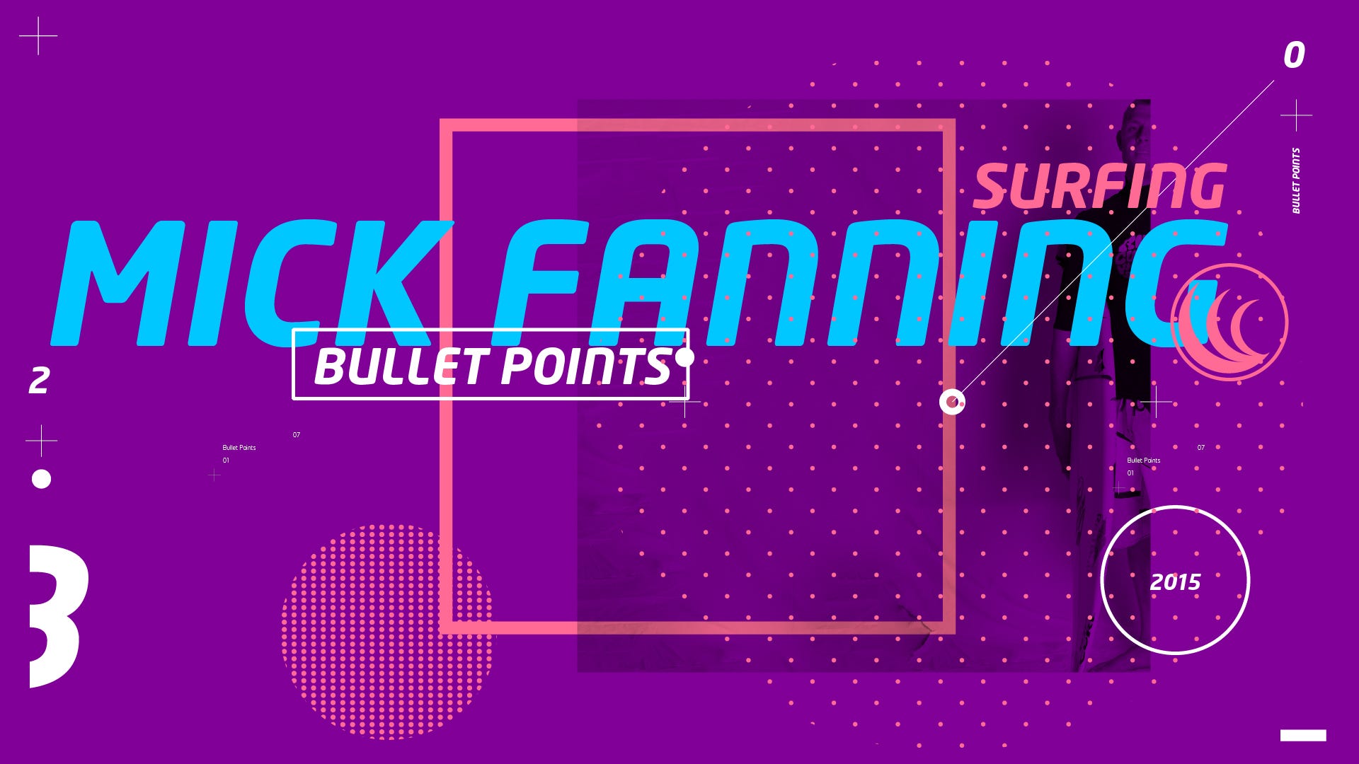
Some of the early sketches that lead to the header image.
How do we structure the research process? Where to start first?
The first part of research should be non-visual.
Open wikipedia and start reading as much as you can about the briefed topic and feel free to explore some hyperlinks to lateral subjects.
Let’s assume that you got a briefing for creating a whole brand identity for a museum (I actually never did a Museum branding but I will try to be creative on this). A contemporary art museum that wants to celebrate 100 years of an artist that works only with colored pencils to create sculptures.
So what to do first? Well, encyclopedia. Lets open Wikipedia and start absorbing as much as we can about that museum:
When was it created? Who created it? Who was the architect? With which materials is it constructed? What kind of previous exhibitions were there in the past? What kind of people go there?
A good client he should provide you with most of this information from better sources, and can even render information about the audience that attend that museum, goals such as if they want to create a hype and bring in new types of audiences, etc. All this information is vital to have at least present at the time of creating the designs.
The next step would be to get deep into the life of the artist.
Who was he? When and where was he born? What did their parents do? How is the history of his work? Is the exhibition about a specific period of his life? Is there a concept for the curatorship of his work? How does he work? Which materials does he use? Is he creating any specific process that differentiates his work from something else? Are there any particular moments in his life that had a great impact in his life?
You should be documenting all this information.
Digital vs Analog?
The answer is: both. You should always to have a notepad with you.
I cannot stress the importance of this. Ideas come and go, and if you don’t write them down they disappear in the ether.
On the other hand the direct connection between seeing all your ideas on paper can fire up new other ideas and can give you a very clear panorama of things that you are missing.
In many ways the “process” is linear, you feed with different sources it but it always goes into one direction and it is your job to explore different directions but eventually decide for one with the client and explore it from beginning to completion.
The notepad is the fastest way to do small sketches and to have a mental record about what you were thinking at that particular moment.
Im a sucker for notepads
I am personally a notebook junkie. Whenever I see a nice notebook I buy it, and I think “here I will write all ideas related to this” and in this one I will write all my project management, or long term goals. In the end, I always use the same. I have a lined Moleskine A5 size for a couple of years that I use for almost everything, and a couple of satellite notebooks that accompany everywhere I go.
I find the connection with the analog world to be a bit more solid. As discussed in the previous post, digital can be fleeting and ethereal. I think there is some sort of sorcery and magic that happens in the brain whenever we pick up a pencil or a pen and start writing.
My guess is that it activates a mixture of creative and logic parts of the brain that the digital world does not. There is always that glass screen that doesn’t let us really connect with the result.
An inside of my sketchbook working on different visual options and ideas for a project called Oxygen.
Text Editors
Whenever I am doing research I use Word or Pages in order to store faster bigger chunks of detailed information.
(In parallel, I create a folder structure in order to store different images that come into my way, while we do the most basic research.)
The other advantage from text editors is that it forces us to start structuring the information, depending how deep we want to delve into the subject.
The times I’ve had the time to do proper research write down notes and deconstruct properly the creative brief, the more ready and secure you are to present your ideas.
Another advantage is that a lot of the stuff I start directly writing on my text editors, I can later on copy/paste into presentations, emails, etc.
Mind Trees
I found the use of mind maps or mind trees not so long ago (cheers up to Ash Thorp and Learnsquared) and I tried to include it to my workflow. I must admit I haven’t stuck to it 100% because new habits are hard to acquire but they can be super helpful.
I would definitely recommend to give it a shot and play around.
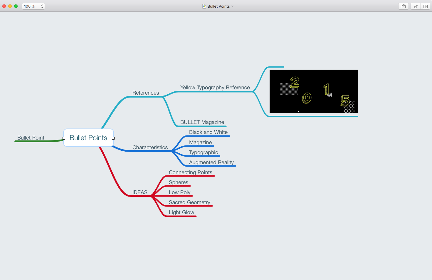
One of the process designs from the Bullet Points project.
Cloud Notes
Evernote, Notes, Reminders, Google Drive.
All these note taking systems are also pretty cool, but I like to keep it simple. I usually have a honeymoon period with each app or service, but eventually I tend to go back to the basics. Notepad, Word, etc.
Since I am a Mac geek, I find the Notes app in the Mac OS and iOS to be pretty sweet. It is very nicely integrated and it feels seamless to sync all your notes between your devices and computers.
Another tool I use a lot for collaboration is Google Drive. Mostly because it has become a web-cloud based standard for word processing and sharing that is pretty much unbeatable. It works seamlessly between Mac and PC and mostly everyone has a Google account for something.
Back to the research!
So now we have our notes, we have our digital tools, we created a nice Mind Tree about the museum and the interaction with the artists, we have some interesting first ideas, we doodled a couple of nice posters, drawn some nice details for a typography game.
We have written down a couple of possible directions and things that have called our attention.
At this part of the process I feel my idea as a small source of light in the middle of a dark space.
We are standing in the middle of blackness and this light is glowing, it comes from both inside of us and its reflected in the exterior of this dark space.
Our job is to connect both lights, the interior one and the exterior.
The strength of the light is pretty weak. It is fragile but as the light glows, we can feel all the colors and the possibilities imploding at the same time, fighting to combine connect and explode into our final product.
The more we feed this light, the richer our project is going to be.
So now we are going to do exactly that.
In order to feed the light we have to diversify our research and start diving deep into our first thoughts and ideas.
Lets say we read that the architect of the museum was working with some special brushed steel material for the exterior of the museum and we feel a small weird connection between this, and some aspect of the life of the artist. For example, he spend his first years working at a steel factory saving money to finance his materials for his first period of work.
My next step would be to dive into the research on the subject of steel.
But this time make a little folder called “Steel” in your computer and start documenting everything that you find about steel and steel production. Make the research visual, try to find interesting things in the steel production, just as special machines, or high-res photographies of steel metal plates, brushed, raw, with special chemical treatments.
We are trying to find both conceptual and graphical elements that might link the museum to the artist. This might work or just be a stupid idea, but its worth to explore.
Another thing you can explore is the work of the artist.
He works with colored pencils, so maybe this can be another another topic to explore. Pencils, pencil production, materials, wood, type of pencils, type of colors, different color palettes. Try thinking of the pencil not as a pencil but as a shape.
Can we make an abstraction of the shape? Can we isolate specific color patterns that the artist is working on?
We can explore the process of repetition that the artist is using. Maybe that repetition is similar to other processes in nature.
The idea is to try to distill all the aspects of our research and try to get as much visual material in order to feed our minds and imagination before we start creating.
Try to go deep into your sources and avoid at this part of the process looking at other people’s work.
This type of research can take you to weird places, and I love that. You can end up reading about weird people that invented weird things or dwelve into 12th century monks creating special pigments for book production. You never know. Allow yourself if you have the time to explore these tangents, but keep in mind that you have to come back and try to respect the brief.
Reference Search
Now its time to dive into the graphic references. I like to have this process after our initial research to avoid getting obsessed with others people work and give some space to some more “pure” ideas.
On the other hand it is also important to be aware of what other people have done with similar briefs.
This part is also essential to the process. Without references (especially good ones) it is difficult to have good guidelines of good quality work.
The first I would do is to look for references of similar projects than the one at hand. Museum brandings, or museum related projects. Graphical images about special exhibitions.
I would collect all of this in a “Museum” folder for example. The idea is to absorb and compare.
It is key also to understand what is going on in the world, and have it present, because we want (or we should want) to create something that stands out.
Some things to keep in mind is that, for example, lets bluntly say that most of the museum work use the same typography and same background — lets assume white — we can already start thinking about maybe making the typography handwritten and use colored background.
In order to open the research we can refine our parameters. Start looking for graphic material from other periods of time. If you can find it in special books, or websites, or even libraries.
The next step would be to start looking at other type of work, from alternative places. Go nuts on Pinterest and do some freestyle research.
Research colors, techniques, composition, posters, videos, go to a museum, go outside and start taking pictures, I find really nice inspiration looking at window displays from high end fashion stores for example. Or just cruising around looking for posters in the city.
Try also to fragment the research.
You can do a specific search for colors, another one for pencils, another one for art installation, another one for typographic arrangements, and so on. Try to be conscious and organized and you will reap the rewards later on.
Proto Ideas
Now you should have a nice folder full of sub-folders with a lot of images from all over the place.
Some text written with initial thoughts, and some random words, concepts and ideas for different directions in notebooks, and random pieces of papers.
If we go back to our poetic metaphor our little black universe, should have now a lot of different colored lights floating around. They are smaller than the light that is coming from inside of use but we can now start to explore these different lights, and start making weird connections.
As a final part of this process one thing I personally do before diving into concepting and deciding for a direction — that I will cover in my next post — is to throw all the images that I have into a big Illustrator file, and start associating different images one next to the other according to random thoughts and connections that I find interesting.
A moodboard I created with images that I took from the internet
With this I already can have a global look on my research and the flexibility to start playing with it. Keep in mind that even though you will spend a couple of days or weeks doing proper research for a specific project.
New ideas will fire up and maybe new input from the client will make you change your direction or point of view on the project.
This is an open process and it is constantly feeding itself.
You might even be in the middle of the production process and you realize that you need more logo references, or didn’t realized that you need photography references for portraits.
Another good tip is to always keep the good sources bookmarked.
You can have a RSS feed with all the blogs you love, but also keep in mind that a lot of artists are creating a lot of interesting work that is more open.
I sometimes use reeder to organize all my blog feeds
They might explore just color, or light, or create some really cool characters without an industry related goal. As an Art Director, you should be aware of all of this. You should have some favorites and you should be constantly in the look for inspiration from everyone and everything.
This a post from Jun 27, 2016, it takes about 11 minutes to read and has some outdated link. I will prepare a revisited version soon once I migrate all my content into the new website.
This is going to be an on-going series about how to learn and improve some of your Art Directing skills. I am writing this in order to structure a bit some of the experience I have learned during the years and try to frame it in a guide that everyone can come either use to improve their skillset or just to be reminded of some of the basic principles that can get lost entering the comfort zone of their careers.
My goal is to both improve your skill set but also try to get you to improve your mindset, so you can think a bit more critically and be able to make conscious decisions about your work, or the work of others.
This first part is an introduction. I will try to explain what does “Art Direction” mean, what an Art Director does and why this role is important in order to bring success into creative projects.
So what is Art Direction?
Man in Black and White Stripe Crew Neck Shirt Holding White Leaved Plant — PEXELS
There are many professional areas where the term Art Direction becomes involved.
I would start by defining that Art Direction is the collection of conscious and justifiable design or artistic decisions that hold together the result of any visual creative production.
Ill try to be a bit more simple. In any design, movie, animation, project, its all the visual decisions that make the final product be coherent in its aesthetic.
For example, when someone designs a logo, the decisions that are made are part of the art direction and have to be conscious and justifiable. The strokes, the typography they use, the style, the colors. If not it just becomes a random selection of resources without any intent (or direction).
Same can happen with photography. The decisions about the light to be used, the composition, the elements that are involved in the frame. If the photographic process involves some sort of production for example in fashion, an art director would be in charge of choosing the backgrounds, design the sets, and can also be involved in the look of the models, the combination of colors, etc.
In the case of motion pictures, an art director is in charge of designing almost everything that we see, from the color but everything that involves developing fake brands, labels, book covers, intro titles, etc involves artistic direction to a lot of extended degrees. Different art directors or product designers are involved in different levels of production. Where it is to define a color scheme throughout the movie, or how will the graphic design of the posters and decorations of the shots will look like.
In gaming an art director is responsible of guiding the whole look and feel of the game. It is in charge of communicating with all the departments of production in order to keep the aesthetic of the game consistent.
In advertising the term art director also applies to graphic designers, that work as a duo with a creative director or copywriter, visualizing ideas. So one thinks the other one makes those ideas happen. Or both.
The term is so vast that it is very hard to cover everything up now, I will try to get into more detail as I write more posts, but this should give a general panorama.
How do I become an art director?
There is no real school for this but I would say the most common places to start are graphic design or art schools. I would take a wild guess and say that a big percentage of the industry standard art directors come from these places. The rest come from other disciplines, and a lot are self taught creatives.
And I guess it all comes down to developing great taste.
Cultivating visual and general knowledge will be always the best way towards moving forward in one’s path in this discipline.
It is really important to have a good “library” in your mind’s eye that is being almost constantly updated with visual references that you can access. Your sources and inspirations will become your tools of the trade.
Most art directors produce most of their work. Or did at some point of their careers. If they are delegating work its is much better for them to have a previous understanding of the creative process.
Books
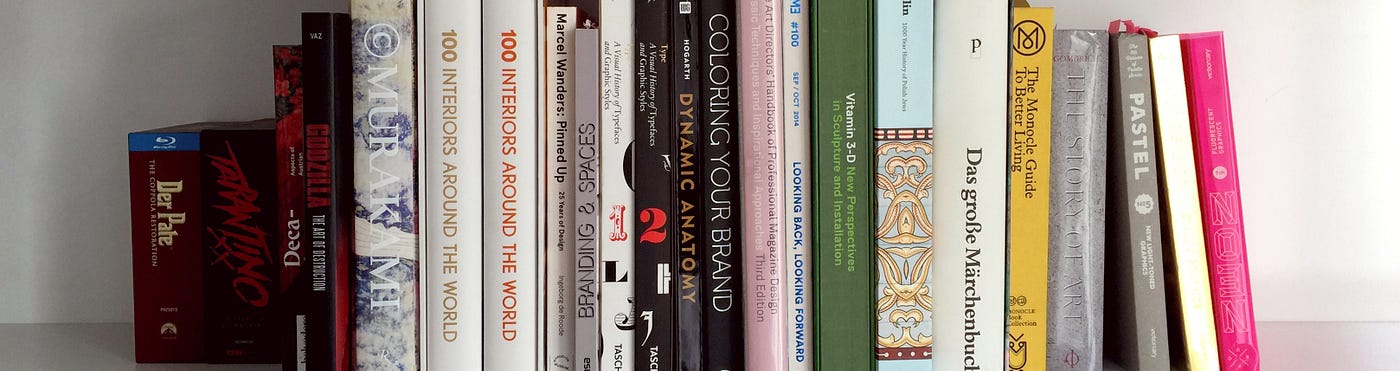
Some of my books and Blue-Rays.
One of the first places to start are books. Most prolific art directors have usually huge design and art book libraries that become their first point of contact with any project.
It is of the utmost importance to start building a good design/art library if you want to have the means to make a difference in this career.
What books have compared to digital resources is first, there is usually a specific theme being presented. Wether it is a collection of photographic works, or a design compilation in most cases there is usually a theme that you know you can look up to. There are always texts written down that try to make you go in depth into the presented subject (although in many cases there are just for filling pages) and the most important thing is the time that you can spend with a book and its material presence makes you in some way develop a deeper connection to the work.
Digital media is ephemeral. It’s there but you cannot touch it, and it really depends on your battery levels and your internet connection. It is as if it feels that with books you can absorb knowledge in a much rooted level.
The time you can spend looking and analyzing one image, how close you can get with your physical eye to the paper and the tactile experience makes everything a whole experience.
Digital media feels just something more mental and not so experiential.
Sometimes I am even surprised when I go to creative’s houses and see so little design books. And I can say almost for certain that the size of your library can at some level correspond with your quality of a designer. Usually all successful and prolific designers are book junkies.
Culture
Pexels
Who you are will directly reflect on your work. What music do you like, what did you listened when you were a teenager, the artists that you admire, the decoration of your home, your general interests, whether it is politics, history, art, etc.
A general knowledge about art in the world and how the different points of view have affected societies around the world. After all an art director should know something about art.
Most schools have some sort of art history course, and a lot of self taught designers/art directors usually have one or two big artists as inspirations that got them into the game. For a general introduction to art history I recommend The Story of Art by Ernst Gombrich.
It offers a general panorama about all art history since the early civilizations until today, and it is all done with work that can be easily found at the most important museums around the world.
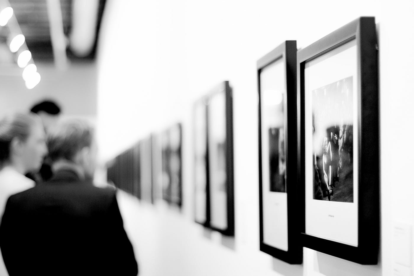
This brings me to my second point: Museums.
Museums are by definition the house of the muses. As design books, the exhibitions are curated live visual content.
It is always good practice to go to museums and exhibitions.
Your mind is open to absorbing information in a different way of a book, or digital, the experience here involves a different state of mind and a physical presence. And you can buy a nice book or two in the gift shop.
I find it also really interesting going to the theater, or music venues. They both involve such an amount of creative preparation and execution that always allows your creative mind to flow in a different state and make unusual connections.
Also the illusion of disconnection can bring out solutions to creative problems that have been roaming the mind for a long and stressful week.
So, all of this is what makes you a valuable individual. To develop and nurture your taste through these experiences means that you are developing yourself and creating value to your profession. It is important to always have a keen and open mind and let curiosity be your guide.
It is also super important that you are open to understand and ask the right questions about everything. Some interesting things to ask your self are:
What am I doing here?
Who’s work am I experiencing?
When was it created?
What was happening in the world at that moment?
Why is this exhibition/concert here and not somewhere else?
What questions would I ask the artist/s if they were present?
Why do I like this?
Digital Tools
PEXELS
We live now in a world and an industry that spins around digital tools to make our lives easier and generate value one click at a time. I don’t really see much room today for any artist or designer that wants to be part of this industry without using digital tools at some point.
I am assuming that you are already familiar with the Adobe creative package. “Photoshoped” has become part of our language, so lets speak about some tools of the trade that I personally use that make my life easier.
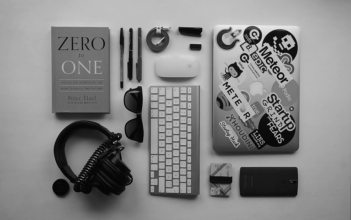
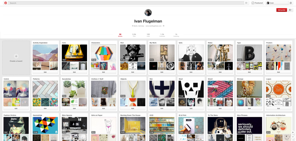
I would say that my first tool whenever I have to do research is Pinterest. They have become industry standard and their algorithms seem to “get me”. This is scary. But the way it is designed for me gives a huge advantage on organizing and categorizing my visual references.
I have tried tagging references, syncing them to my different cloud accounts but in the end this takes so much work and investment that I end up using just Pinterest and then browsing the dark corners of the internet for lateral references using my own personal mind library.
The biggest disadvantage that we have with Pinterest is that you get to see a lot of already processed work. You don’t get to the core of things, but just look at masticated and regurgitated beautiful images that present the current state of the zeitgeist. Be careful with this.
But a good art director will know exactly up to what point use and what to use from these images. I will expand more on this in later posts.
My personal Pinterest collection
Google Images
My second in command image search engine. This looks around the whole internet and tries to find the best match according to your search. It is not tainted by design, and you can filter really good by usage rights, color, and size.
It is great to find some of these hidden gems that are in the public domain.
Picasa.
I use sometimes Picasa’s collage tool to create moodboards. Now a days it is called google photos I think and the tool is still there but it is a bit more uncomfortable to use since it’s all web/cloud based. I recommend getting an older version.
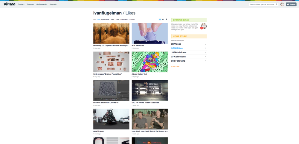
Vimeo.
Since I am involved in the Motion Graphics / VFX branch I use Vimeo as my number one video inspiration. I like the website Motionographer too as a curated selection of great Motion Graphics and Interviews but Vimeo as a social network feed of what all my colleagues and studios that I like are looking at the moment. I get a great source ranging from finished work to more experimental tests, etc.
My Vimeo likes
Blogs and RSS feeds.
There is a TON of beautiful work and curated content out there. Something similar happens to me like with Pinterest, but there is SO MUCH information going and all these beautiful curated blogs, but in the end I have the feeling that they all dissolve in the internet’s creative ether.
Sites like tumblr have beautiful curated work but they become just a compilation of beautiful images… and that’s it.
There are some specific blogs that have a very strong focus in curated content and a bit more exploration on the work such as Bibliodissey that focuses on book related stuff, buthowdoesitfloat, etc.
You can collect all this information using an RSS feed and create your own curated feed of curated content delivered on demand.
I can go forever (and probably will later on), there is always a new tool coming up ready to replace an old one Pinterest replaced FFFOUND for example.
In my personal opinion it is better to keep it simple. I always keep a folder in my desktop called “PicRefs” where I just collect the nice random things that I find on the internet, and I take a look every couple of months or so. It is very pleasing to actually see those references and they take you back to that moment where you selected them and you can also see a line that reflects your taste and interest through time.
Spend some time exploring great inspiration sources, analysing them and categorizing them for future use.
Summing up
I have just written about a basic spectrum of basic things about being an Art Director. This is a very broad discipline but some of the foundational elements can be shared along the line of the different areas.
One last thought for this post is that a good art director is also a good communicator. Without being able to communicate your ideas and thoughts to someone else will be the difference between success and great success in any creative endeavor.
It is important to get this basics right. General knowledge and good access to creative source material is key to start. And critical thinking and a constructive and de-constructive mind open the paths to better work and ideas.
I guess that if you found this post in this platform most of this stuff is covered, but in that case, take it as a reminder of those basics that we sometimes forget. Most designers now look only at digital things, go back to books.
Others just go home and watch television or browse reddit and forget that going out to a concert might as well open your mind to new ideas and people could spend part of their weekends exploring the cultural offering from your city/town.
Read a book about the life of David Bowie or explore the futuristic possibilities of virtual reality in Ready Player One. Enrich your life so you can enrich your work, it is that simple.