We have covered now the early stages of the creative process for an art director and now it is time to move into the early phase of preparing a concept or direction for your project.
This is a process that involves a couple of different phases. I will try to guide this in a perfect world scenario. But each project is different and most of what I share at this point is going to be flexible.
Conception refers to the stage of the process where you have to create a concept based on your visual ideas.
In a real world scenario you would establish with the client different stages for feedback, and different stages for changes. It may happen that different clients have different requests, or that suddenly the whole marketing team changed and you have new people with new ideas, or they just want to change things to establish their new authority.
There are many ways of guiding a client, and my personal recommendation is that you always keep him in the loop and involve him at the steps you need him to be involved to move your and his idea forwards.
It’s really important that before even start working you agree on how you are going to work, you should explain him your process and how you are planning to move forwards with each phase of the creative process.
You are being hired because you have a set of skills that they don’t and it is your job to guide them through your knowledge to what you think is best for them. This should also show in your project management skills.
So, after a couple of calls you end up with the following task.
Create a poster about the film “Donnie Darko”.
Rough Directions
After your research is done you will have floating around your head a couple of ideas that you believe are stronger that others. Your guts will probably will be pulsating into going into a specific direction, and I will advice to trust your feelings Luke.
If you start with around 5–10 ideas I would recommend that you start trying to combine the stronger ones with the weaker ones. Or just try to see which ideas are similar, and start distill and concentrate all your creative power into 3 strong directions.
You should aim to have at least 3 possible directions to present.
Why 3?
One direction is very limited. There is no room for movement and give the client no chance to feel part of the creative process.
Two directions seems a little bit binary for my personal taste. You are basically telling the client, you can have either this or this. No-Go. It is not necessarily rude, but a little bit limited.
Three is for me a good number of choices. You can have a strong direction, an alternative and one completely different direction. You can mix it, or you can present 3 different options that can complement each other.
You can go for more options, this can be done if your client is more creative and you are in a rush trying to grasp what the client or project wants but if it is a formal presentation I would keep it simple. You do not want to overwhelm your prospects.
So lets say now that you have 3 different options for a specific topic.
You have a folder with all your references, your research, etc.
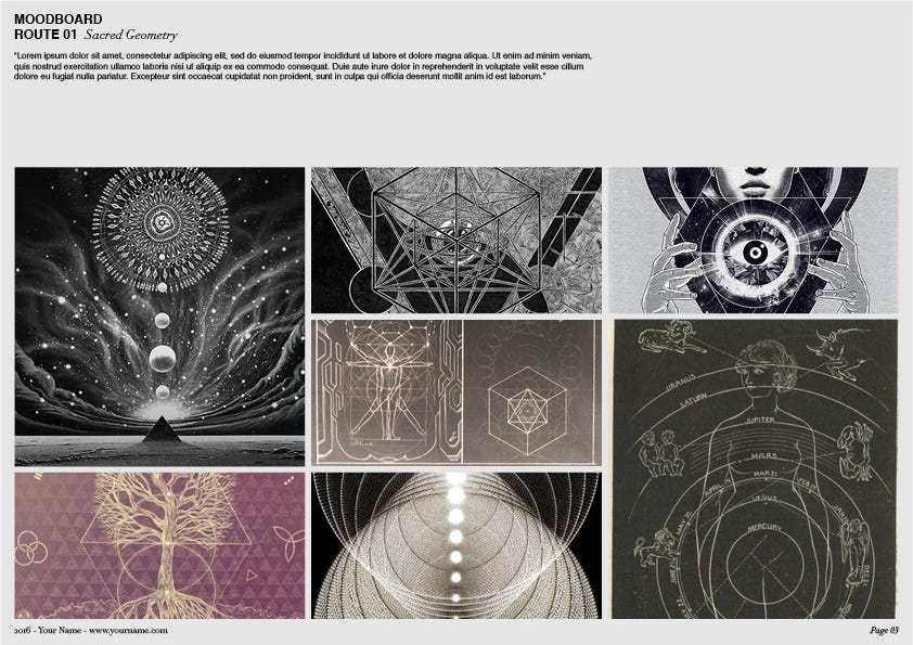
For our Donnie Darko poster we will present 3 quick possible directions.
Route 01: Time Travel — (Sacred Geometry, Math, Occultism)
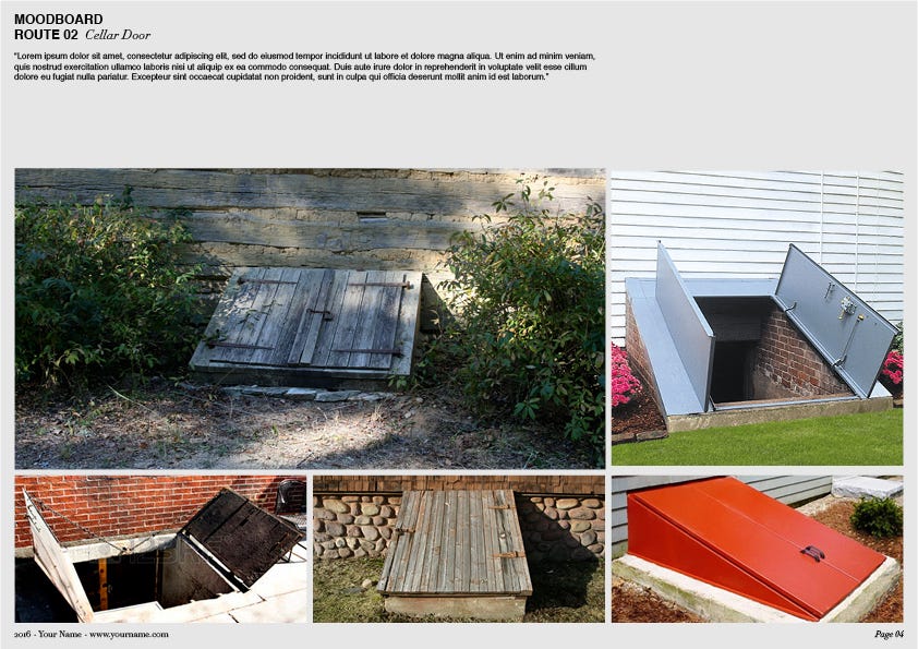
Rout 02: Cellar Door
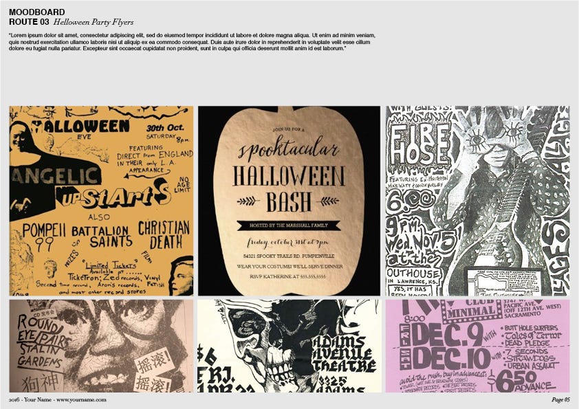
Route 03: Helloween Party Flyer
Moodboards
Start creating moodboards.
A moodboard is a collection of reference images that try to illustrate a specific concept or idea by grouping different elements trying to convey a specific mood.
It is a map of your idea, using references of images that already exist, to try to guide the client to imagine what it is in your head.
So then when you share this with your client, you can discuss with him specific things. Such as “Do you like how this typoghraphy is working on this book?” “How do you feel about engraving it into a piece of wood?”
Dont place random images because they just look nice, try to find nice images that tell the story that you want to tell.
I sometimes try to tell stories in my moodboards, or organise them in such a way that they tell a story, maybe I will use landscapes or more abstract things in the left then towards the center introduce my characters and towards the right have some images that have a conclusion.
The idea here is that the client can read through and get your point.
This is a very subtle but key element when designing your moodboards. One very common misuse of this basic resource is just collecting images that look nice, pass them over and expect that the client or even other designers, get what you want.
You can really tell the quality of a designer or art director by the quality of their moodboards and how they express their ideas.
So now that you have your moodboard ready, it is the time to present your ideas to the client.
Note — For some inital parts of the process. Moodboards might just be a visual tool to get the client moving into one direction. After this is established more narrative moodboards, or moodboards that involve a bit more different images might come into place.
There is definitely no specific rules for creating moodboards, I think with great taste you will be able to express your first concepts, but be careful and keep it simple and tasteful, do not include things that you don’t want or are not sure because it is usually a rule of thumb that the client will pick up that one.
Presentations
A good presentation is a maker or destroyer of creatives and projects. The presentation is the medium where you will present your ideas. It becomes the guiding document for briefing your client, team, colleagues.
As a designer it is good to have some general idea of editorial design. Once again whatever we are doing here is presenting and selling our work and our ideas. A good presentation has to be clear and understandable. Everything has to be explained to the last detail.
It has to be ready made to be opened by someone that has no idea whatsoever about the project and by the time he finishes reading it it, he is sold with the idea.
It has to be clear and everything has to be explained, and if you design it well it will bring you a lot of success.
The following is an example of a good structure for a good presentation.
Cover — the cover page is the page where you present the project and the most general details about it such as date, client, and project name.
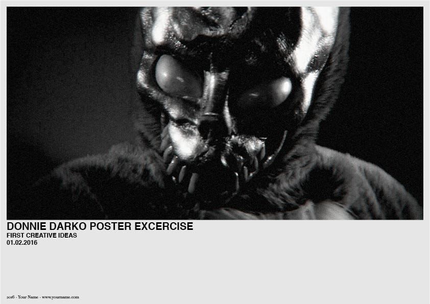
First Creative Thoughts — a brief introduction about the project. Here is where you state to the client your understanding of what you have to do and how you want to do it. The goal here is to introduce your vision of the project.
Challenges — sometimes I include a page that talks about the challenges that the project has to meet and the ones that the project is going to face. So for example we speak about the creative challenges that we want to accomplish, and the reality challenges that will influence our goals, such as limited budget, resource availability or time.
For the first presentation I would dive directly into the first different routes.
Do not fear over-explaining everything or being redundant. As mentioned before the presentation has to be self explanatory in every point.
Route / Direction 01–02–03 — So, I will assume I have a Title page that says “Route 01". Try to name every concept, this is actually part of the conception phase. It is up to you how creative you want to be with the naming. Some people are more playful or witty, some people prefer to be more direct.
The title has to resume your concept in one, two or three words. Try to make it catchy. The title has to resume your idea so when the client looks at the images he can already start constructing your vision in his head.
You should add a small description of your concept / idea and explain the benefits of this one.
After this, you can introduce the moodboard.
Conclusion (or finishing thoughs, summing up, etc.) — in this slide you will wrap up all your ideas. You can write down your top choice and why you recommend going into that direction, or just write some other things that are in your mind worth talking with the client.

Contact — Be mindful to include a thank you page with your contact information.

If your presentation is branded, much better. I mean, why would you not brand it? You are a professional right? This branding has to speak about yourself. You can have a logo, or your name, but the choice of color, typography and editorial design will also speak about your skills as a designer.
The best advice here is to have a template presentation with a template structure for the moodboard to speed and structure your whole process. This is key for every professional. Create assets that will save you time and energy.
Respect the grid
The grid will help you stay fit and organised. You will have to discover what grid works best for you and keep it in an editorial fashion.
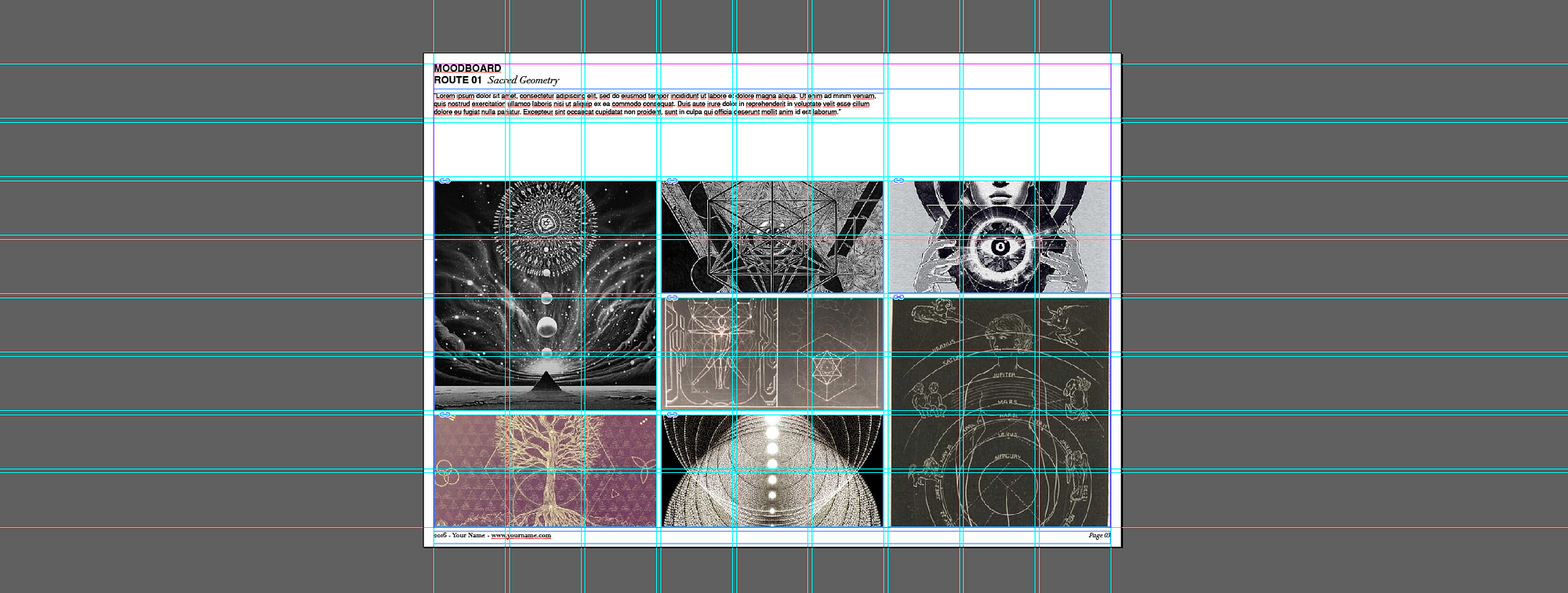
This is the grid I used for one of the moodboard. If you compare the 3 you will notice that I modified the arrangement and the size of the masks of the moodboards but I kept using always the same structure. This will help keep your presentation entertaining and organised.
If you want to break the grid and be a bit more décontracté, do so at your own risk and only if you need to. I do not mean to preach a hard school on grid, but it helps to keep everything in order. If you want to take a creative licence with it, keep some other constants respecting the grid.
In other words, arrange the images as you want, but respect the rest.
Preparation
As a side note, it would be great when you can; before sending the presentation to the client to rehearse it a little bit.
In many cases you will just need to send over a PDF with your presentation and then keep the communication by email. But in many other ones you need to call the client and guide him through.
From my own personal experience, I prepare the presentation, read it 50 times, and believe that everything is perfect. But then when I am presenting it to the client I realise that there are many things that are not clear enough, or that I become very redundant or that the copy doesn't allow me to close up my thoughts. Or even find myself reading the copy out loud and realising that what I just read doesn’t fit the context of the conversation or I just said the same that I did 2 slides ago but with different words adding absolutely nothing to the pitch.
If you have some time, maybe some audience, try presenting it to someone else and fine tune the things that make no sense spoken out loud; listen to yourself and watch other people’s reactions.
Software
My two best options for presentations are Adobe InDesign, or Keynote.
Adobe InDesign is a great tool for creating editorial design. It is optimised for doing hardcore typographical work and it has a great grid system that will structure your output very easily.
It isn’t a very flexible program and it is a bit hard to edit images on the go, but I assure you, this is what you need. Use the grid. Be mindful of it and reap the rewards. You want structure and you want editorial. This tool provides you with that.
Apple’s Keynote, on the other hand is a more flexible tool. Very good for live presentations. You have some sweet animations and transitions and its very easy, fast and flexible to edit things on the go and spice up your work. But this flexibility can be a bit costly in terms of design.
If you do not keep track of it you might in time, start dragging errors and your presentation form will get lost.
I would not recommend Power Point. This is one of the most unsexy and terrible tools I have ever encountered and I am still shocked to understand how it is an industry standard.
So now we should have our beautifully designed presentation with our 3 routes and ideas. It is time to present it to the client.
Everything went great and he decided to go with the Route 01 — Time Travel, yeah!
It can happen that he also likes some ideas from the second direction.
We take notes, and agree to a polished development of the idea for a second review in 1 week.
Now it is time to keep working. This has just begun…
Thank you very much if you read this far!